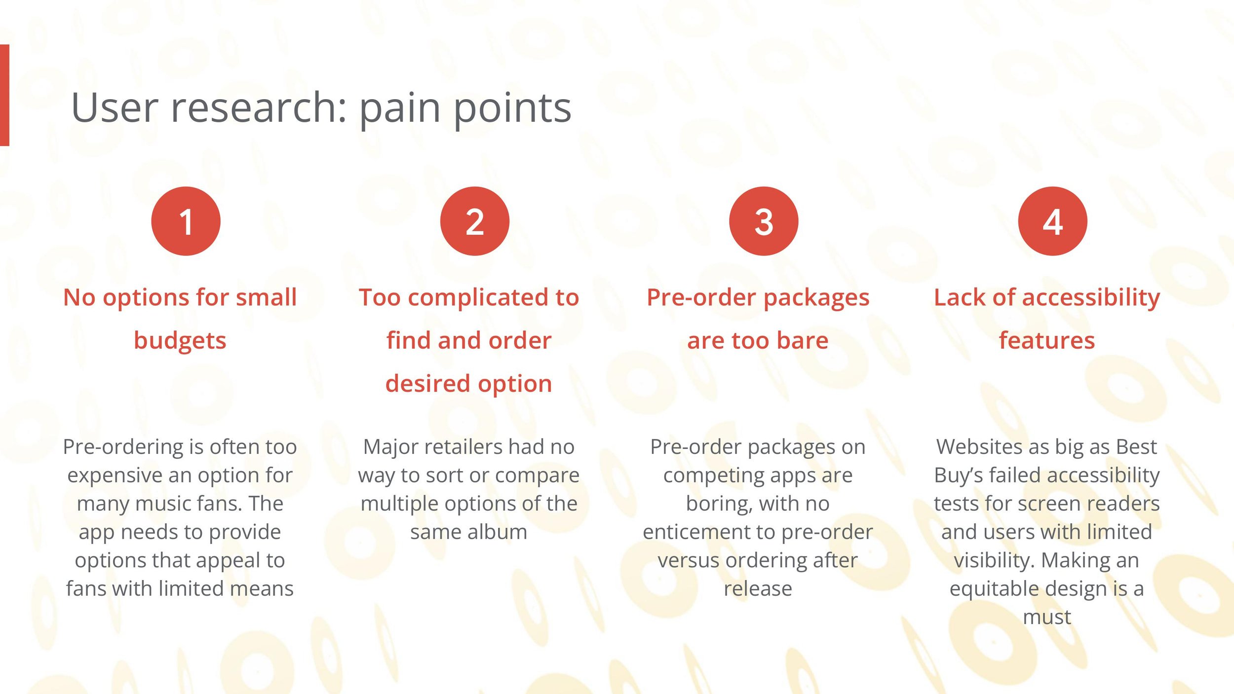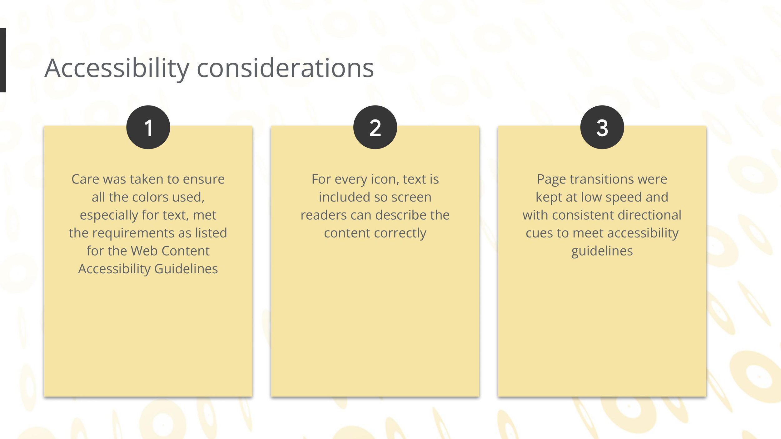
“Websites as big as Best Buy's failed accessibility tests for screen readers and users with limited visibility. Making an equitable design is a must.”
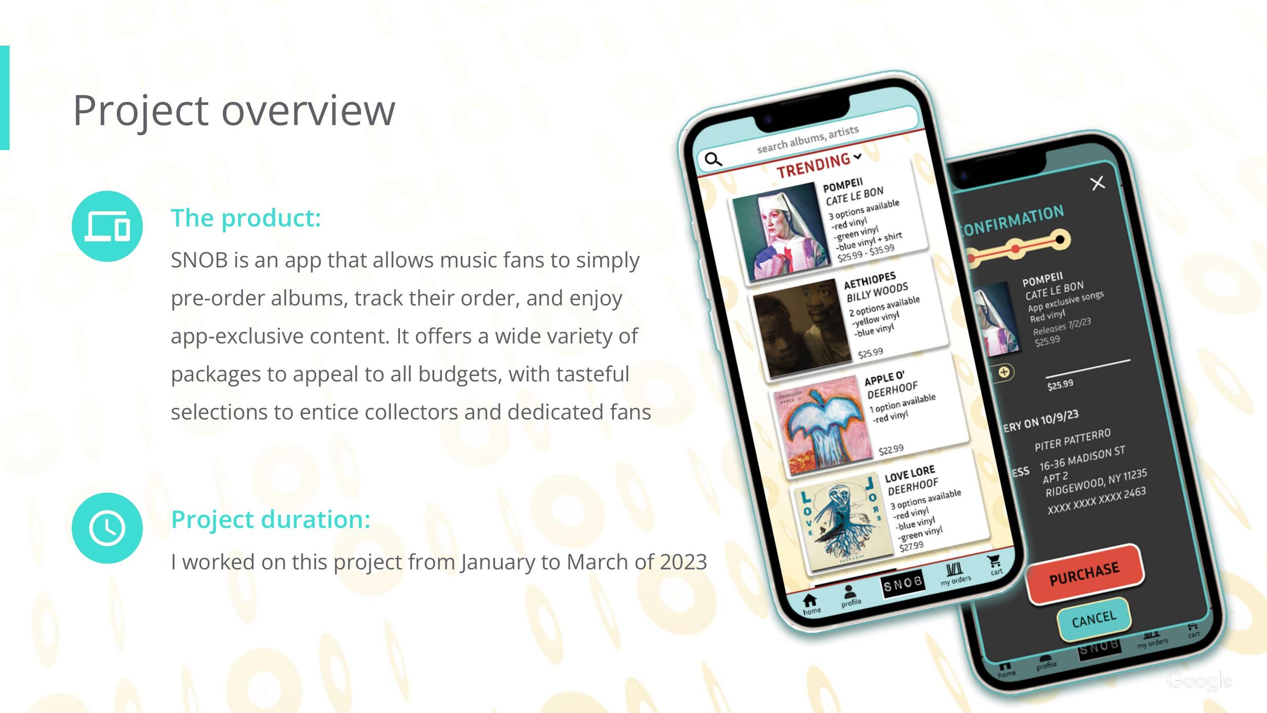
overview
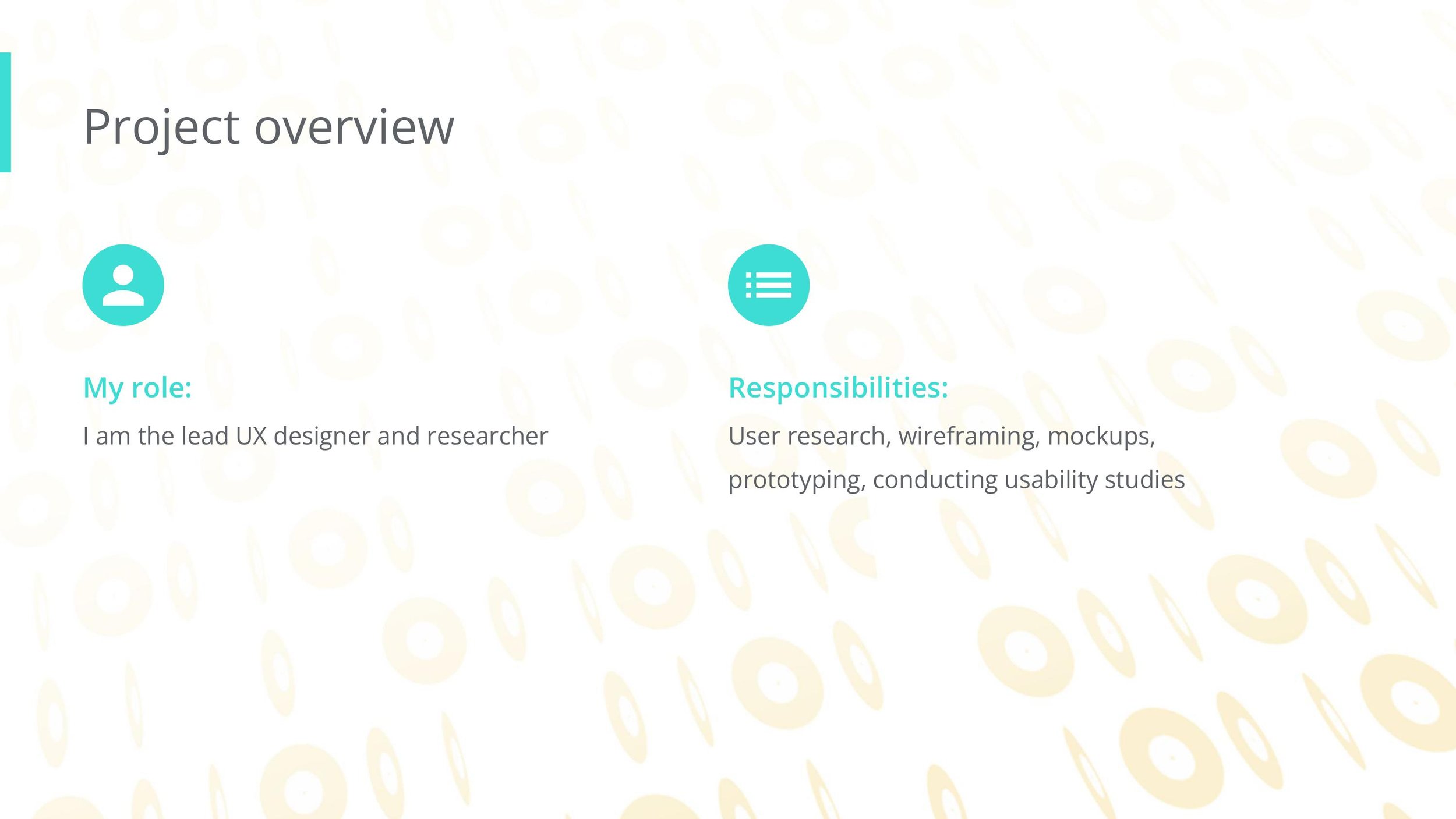
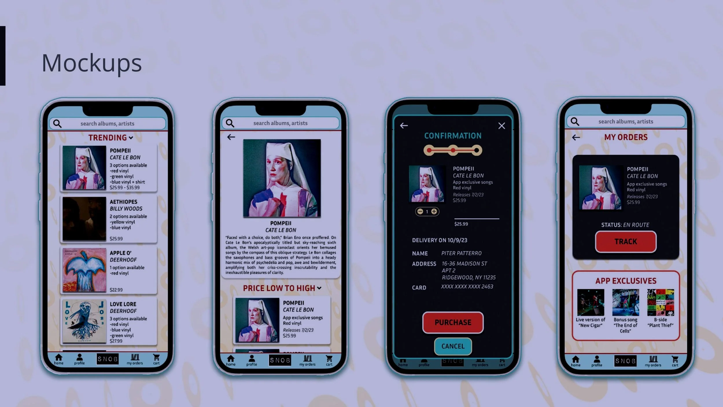
SNOB is a mobile app that allows users to pre-order albums and access exclusive digital content. I created everything from the wire frames to the high fidelity prototype in figma. The biggest learning moment I had was the way accessibility can inform color, font, and overall design. Finding resources on how to choose colors for users with low vision revolutionized how I approach coloring, and provided new solutions to a problem artists always have: how can I make this stand out more?