
“Would it be alright if I tattooed the podcast symbol on myself?”
-A surprising number of people
overview
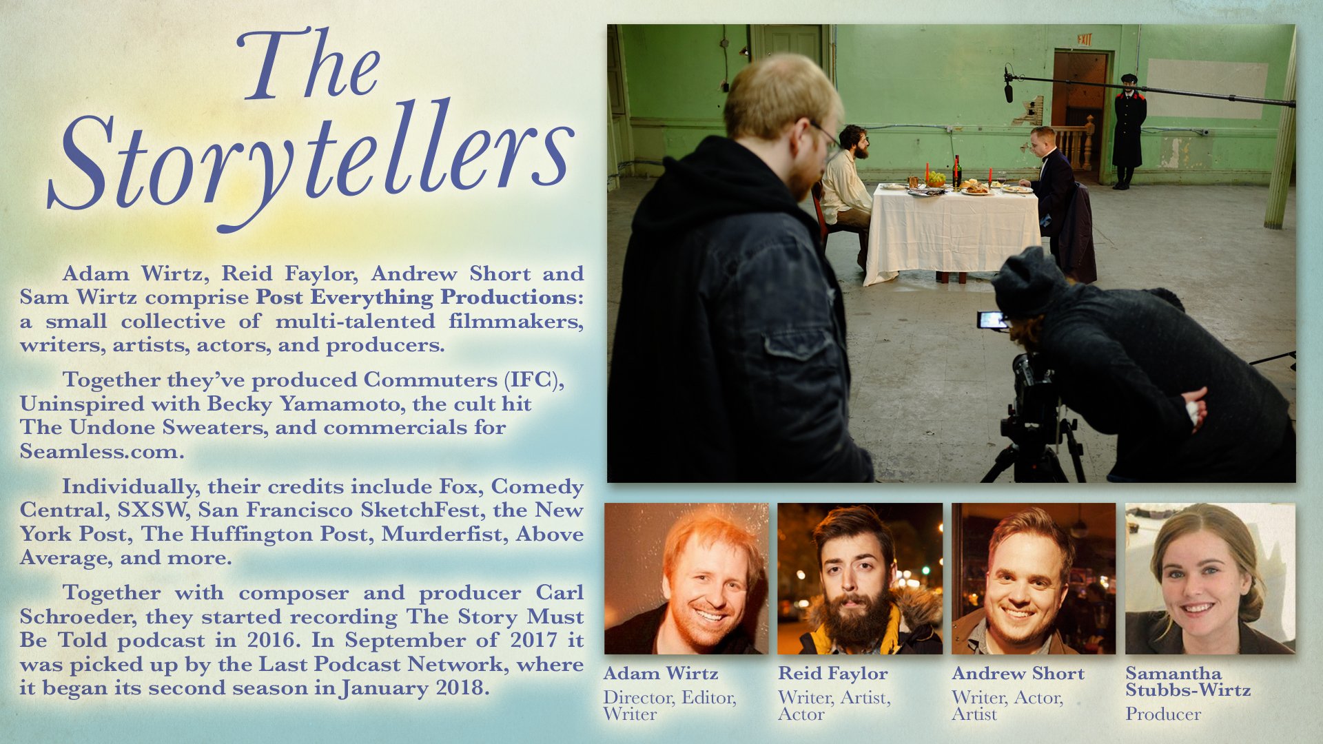
For this creepy short fiction podcast, I was given the task of completely spearheading the branding, merchandise, and online presence. I was able to grow with the podcast and refine the art to reflect the show’s message and personality in every aspect of their design, from the podcast logo itself to the membership cards for eventual patrons.

logo over the years
First logo for the trial first season
When the podcast first started in 2016, the direction wasn’t entirely clear. It was more or less a spooky story podcast, and the art communicated that.

Updated cover for the Last Podcast Network.
However, with the shift to the Last Podcast Network, the format was reworked to place the stories in the context of a story-worshiping cult. The appeal wasn’t so much obvious scary imagery, but in making an uncanny version of a real cult. The new logo borrowed more from the illustrations on religious pamphlets—a primary color scheme, soft glows, smiles. The font was kept largely the same for consistency. However, only one of the creators was featured, which felt like an incomplete representation of the show.
Final version
The final version incorporated the most identifiable character from the podcast, Chalms. The focus wasn’t on the hosts, but the overall lore of the podcast. The cryptic symbol of the podcast was tucked away in the top right, a hidden treat for those who view the larger image. The image was also cleaner and less yellow-washed.
The show is on a break at the moment, and when they come back I expect to update it again. My current thought is a total 180, from cartoony to realistic, perhaps even photographic.
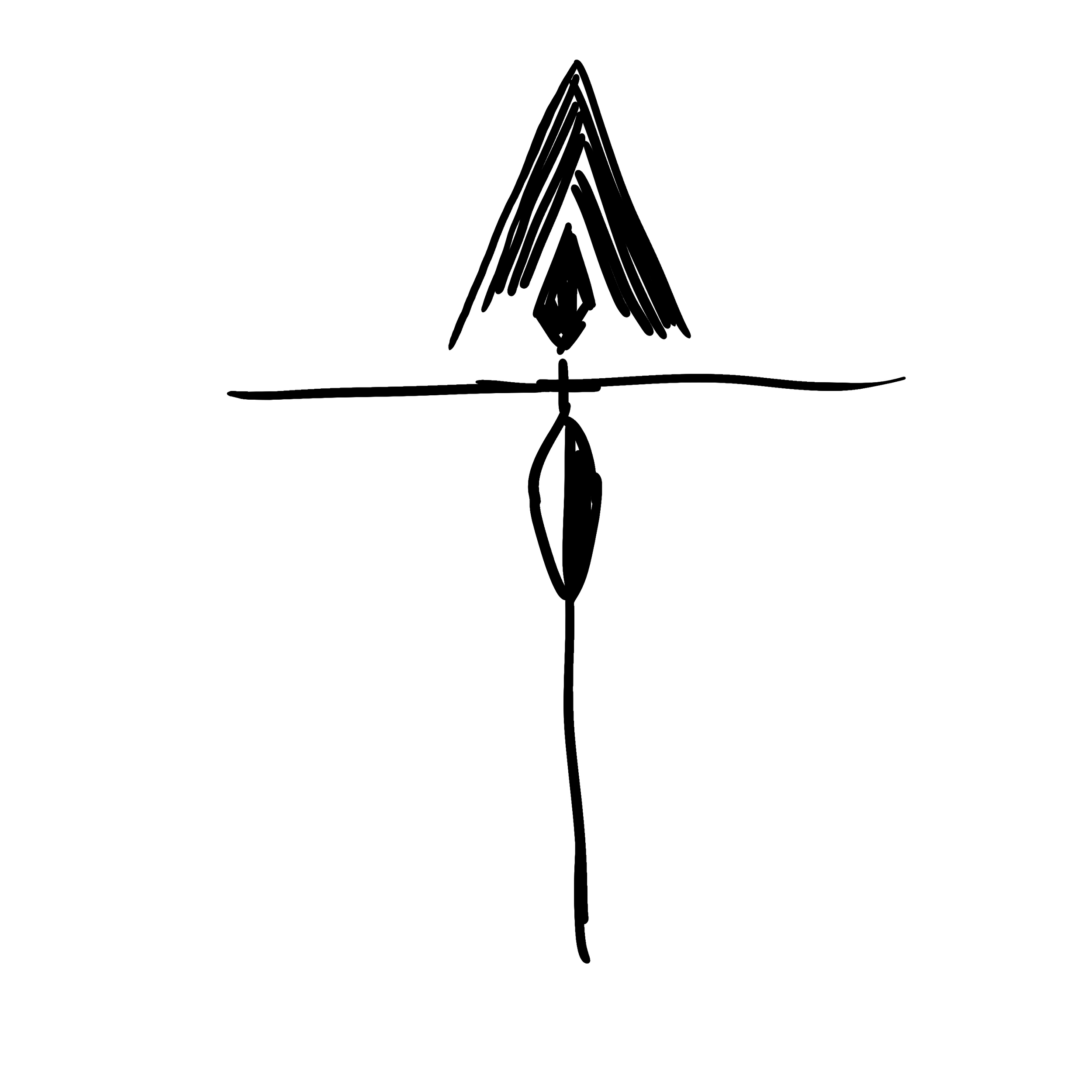
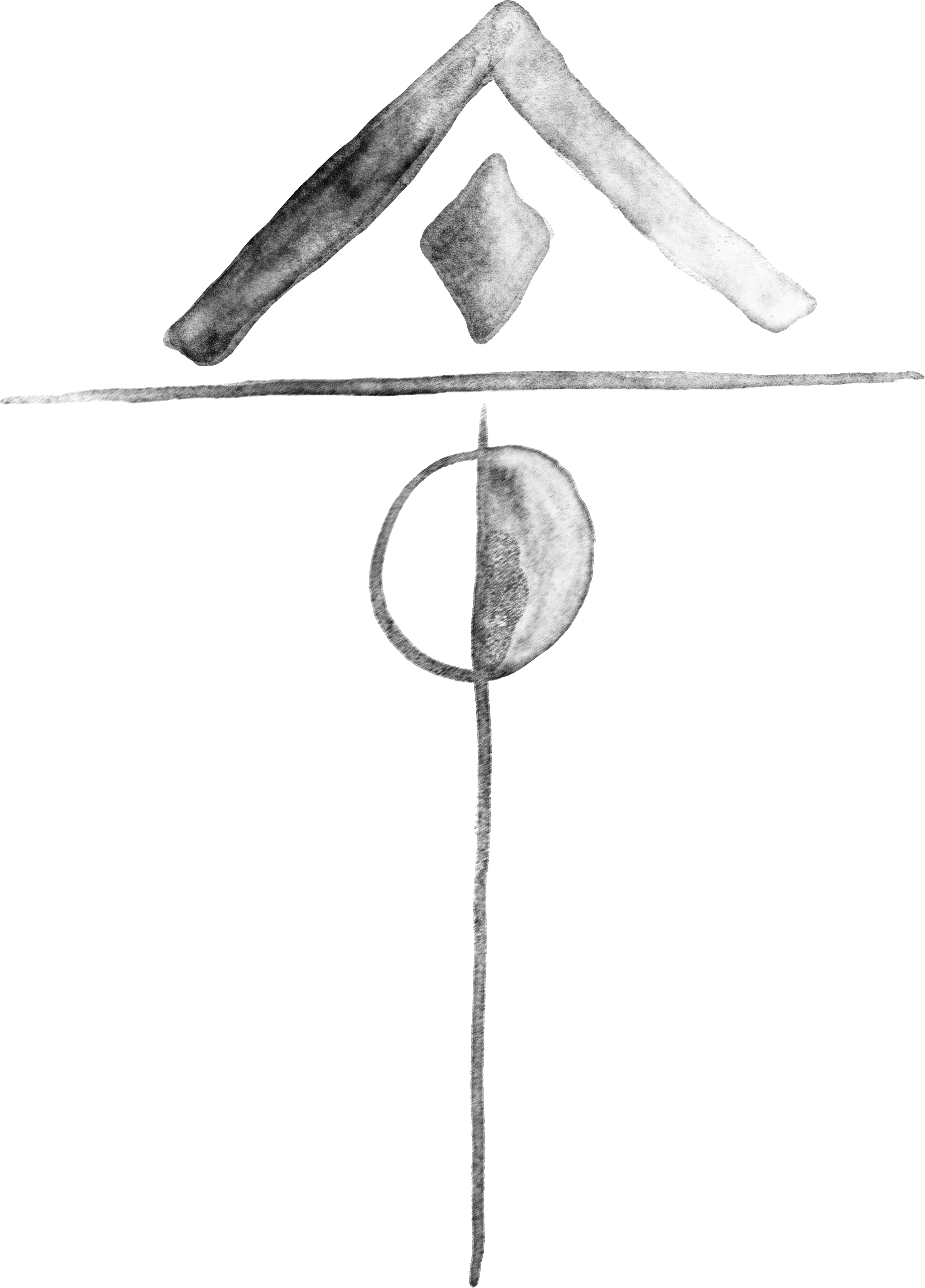
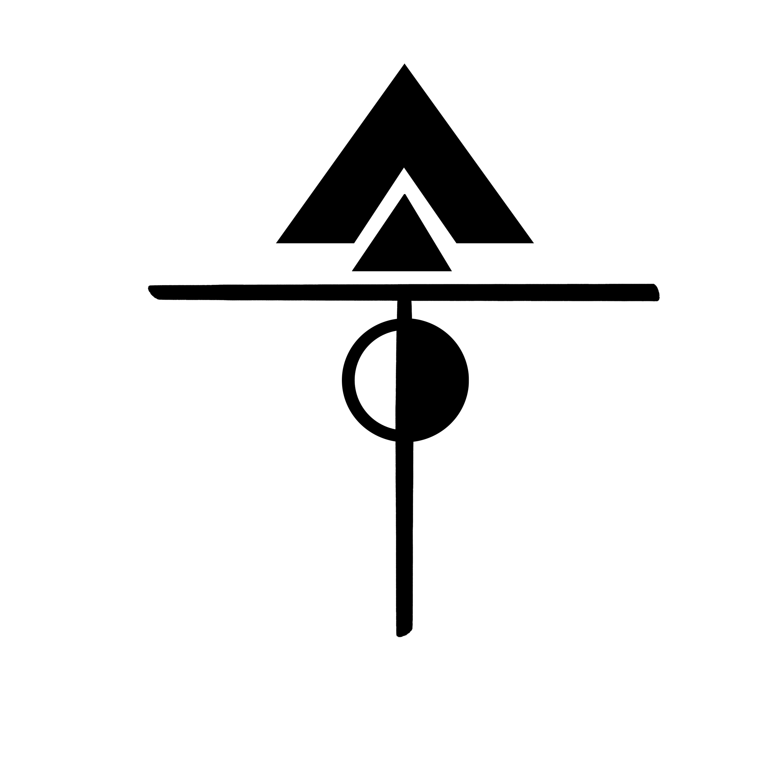
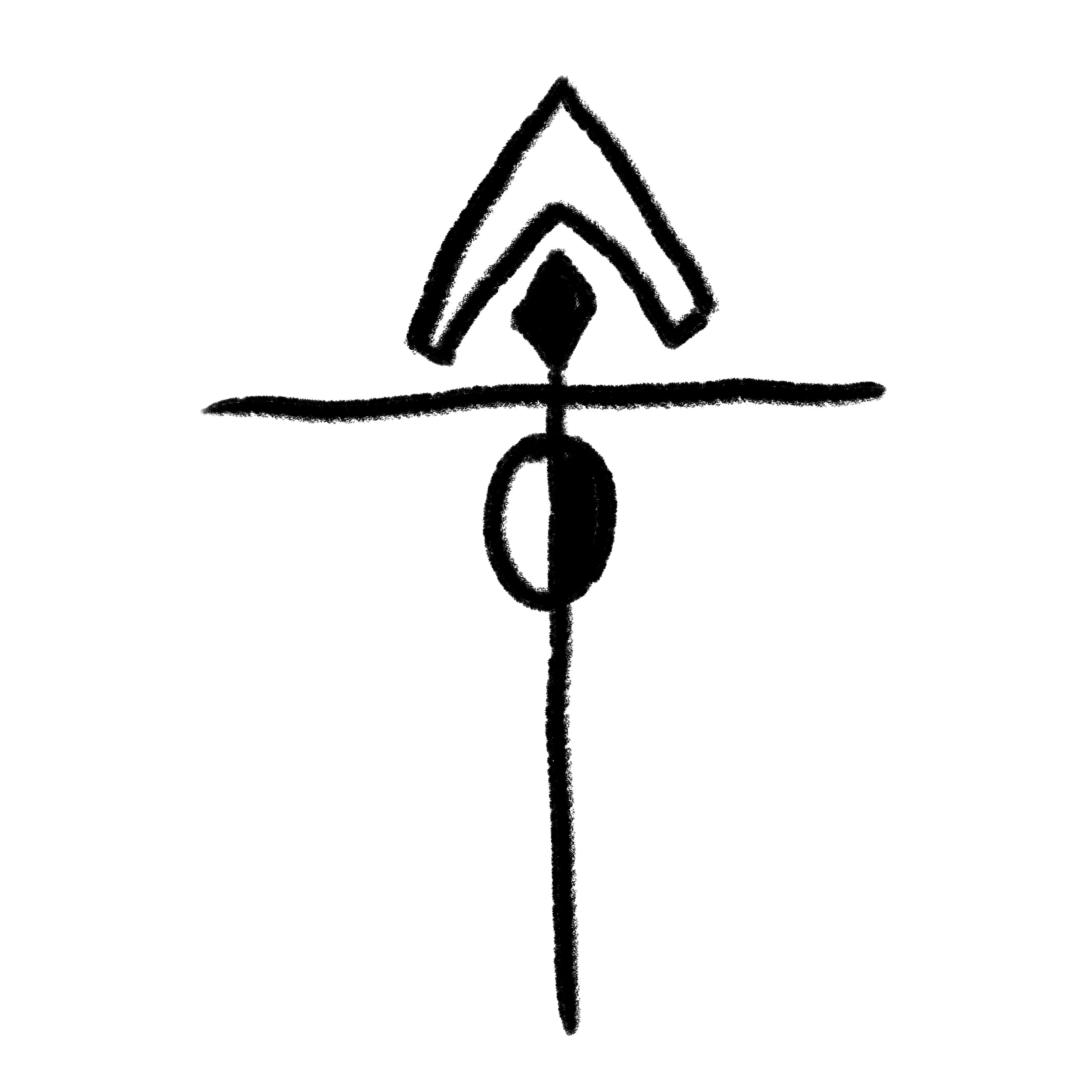
The cryptic symbol
The cultish aspects of the podcast were very important—the podcast was framed in a weekly cult service, and each story was a reading from their holy book. It felt proper to give this fake cult the authenticity of a real one, complete with a symbol.


I went through pages and pages of symbol designs. I ended up with the strange cruciform symbol, as it felt like the podcast in some ways—a distorted parallel to modern religious iconography. It felt recognizable, but off, that perfect uncanny feeling.

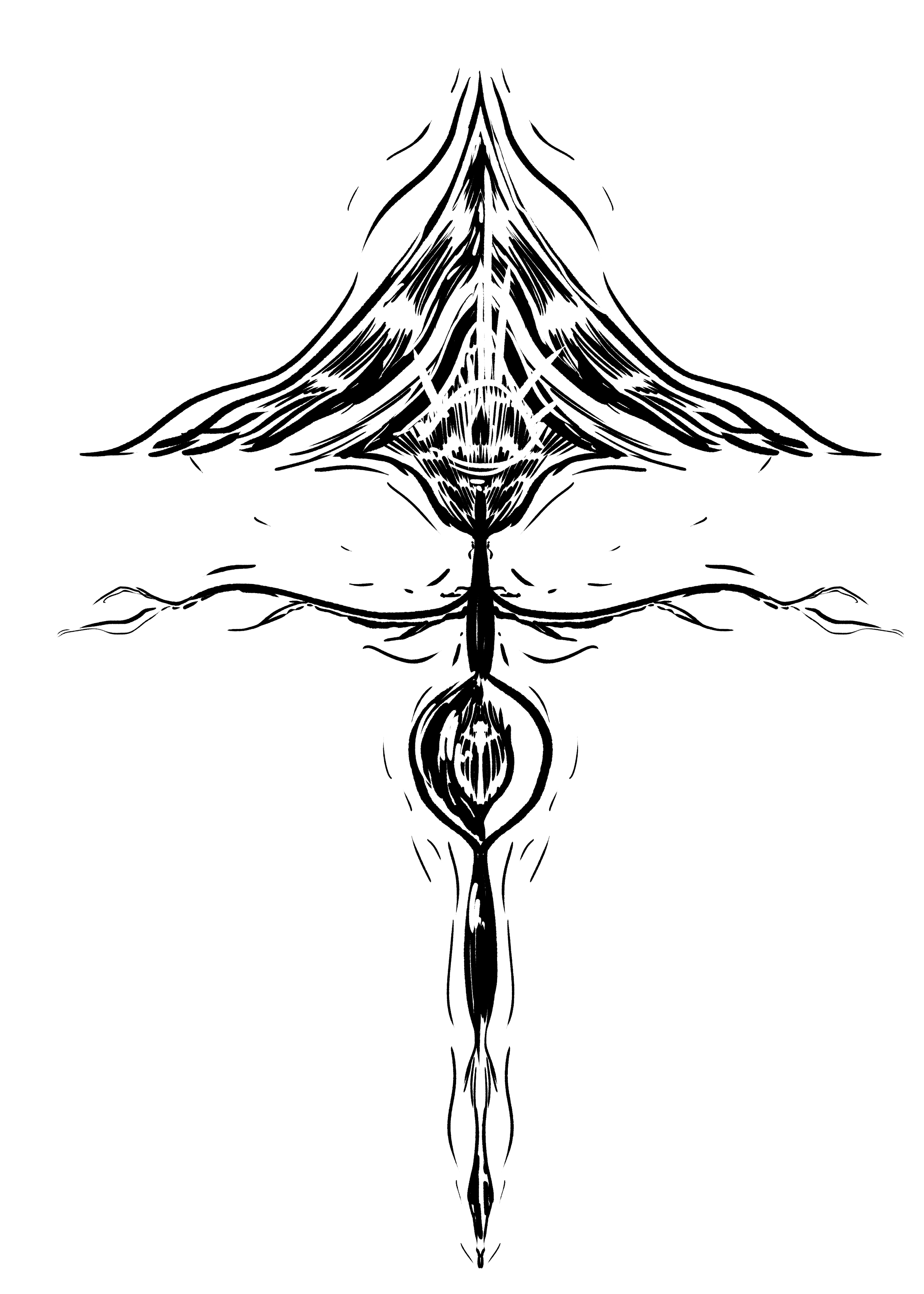
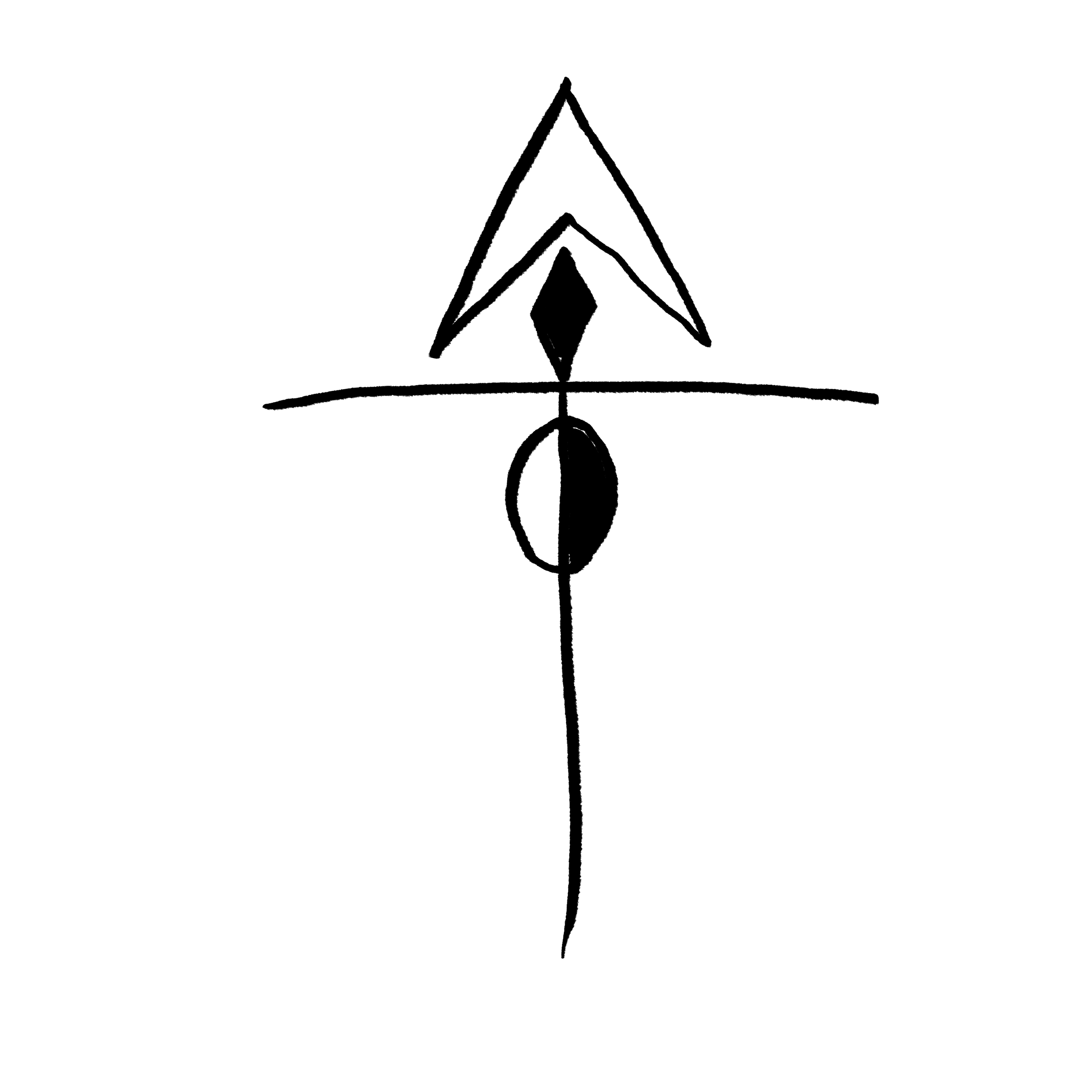
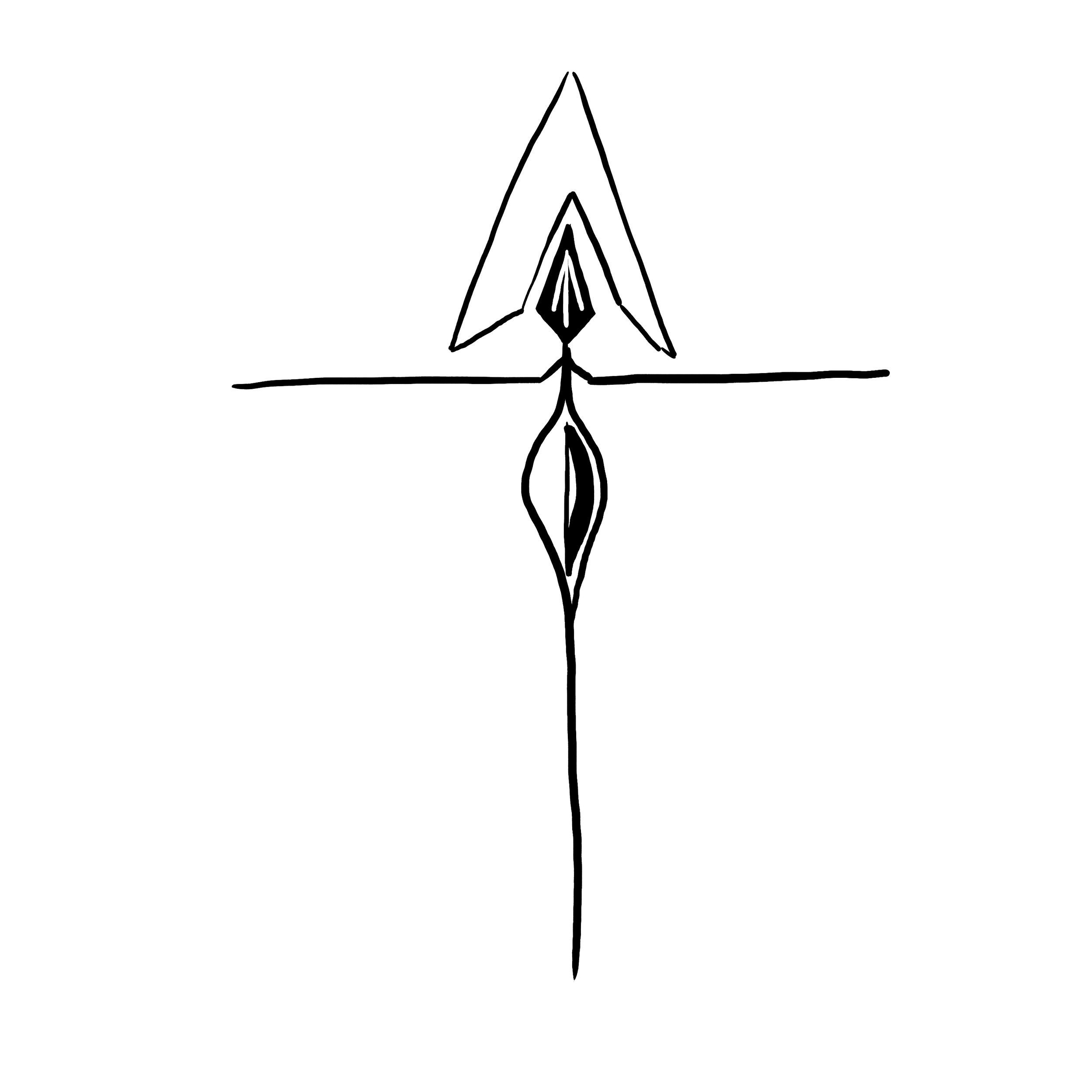
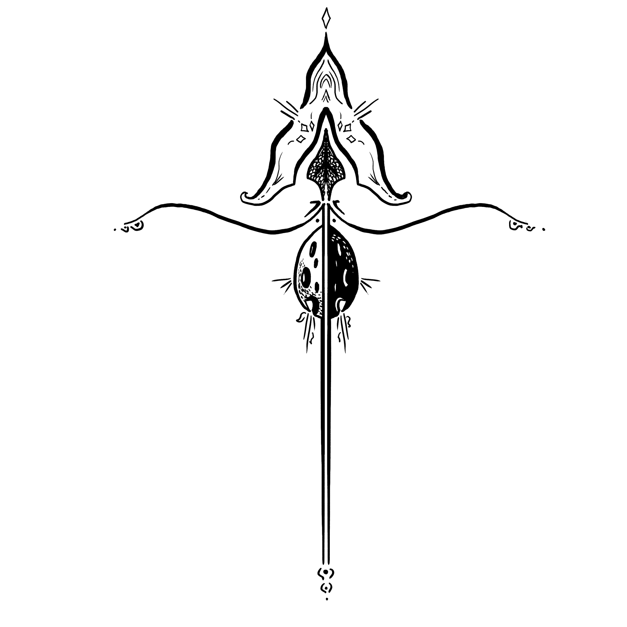
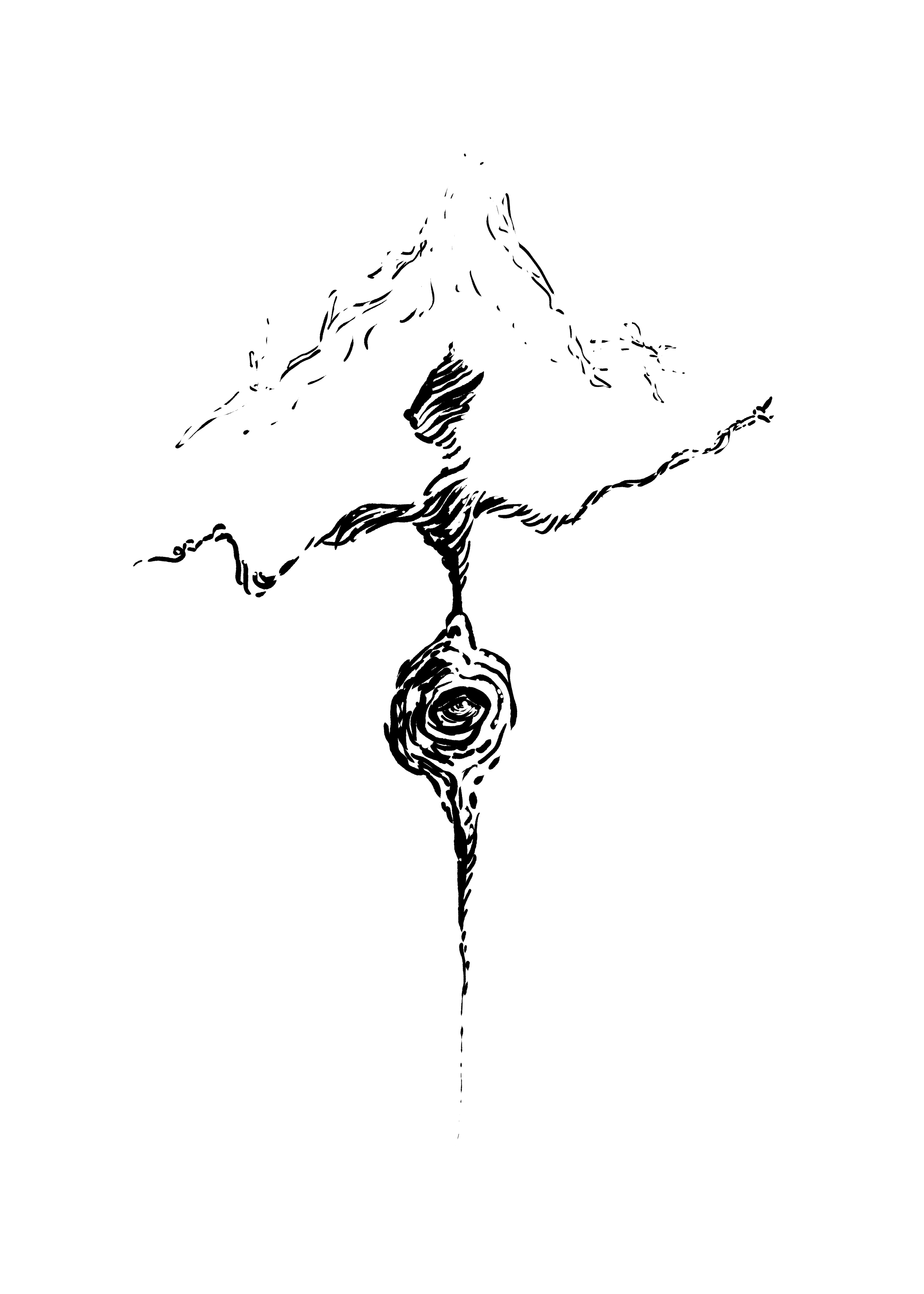
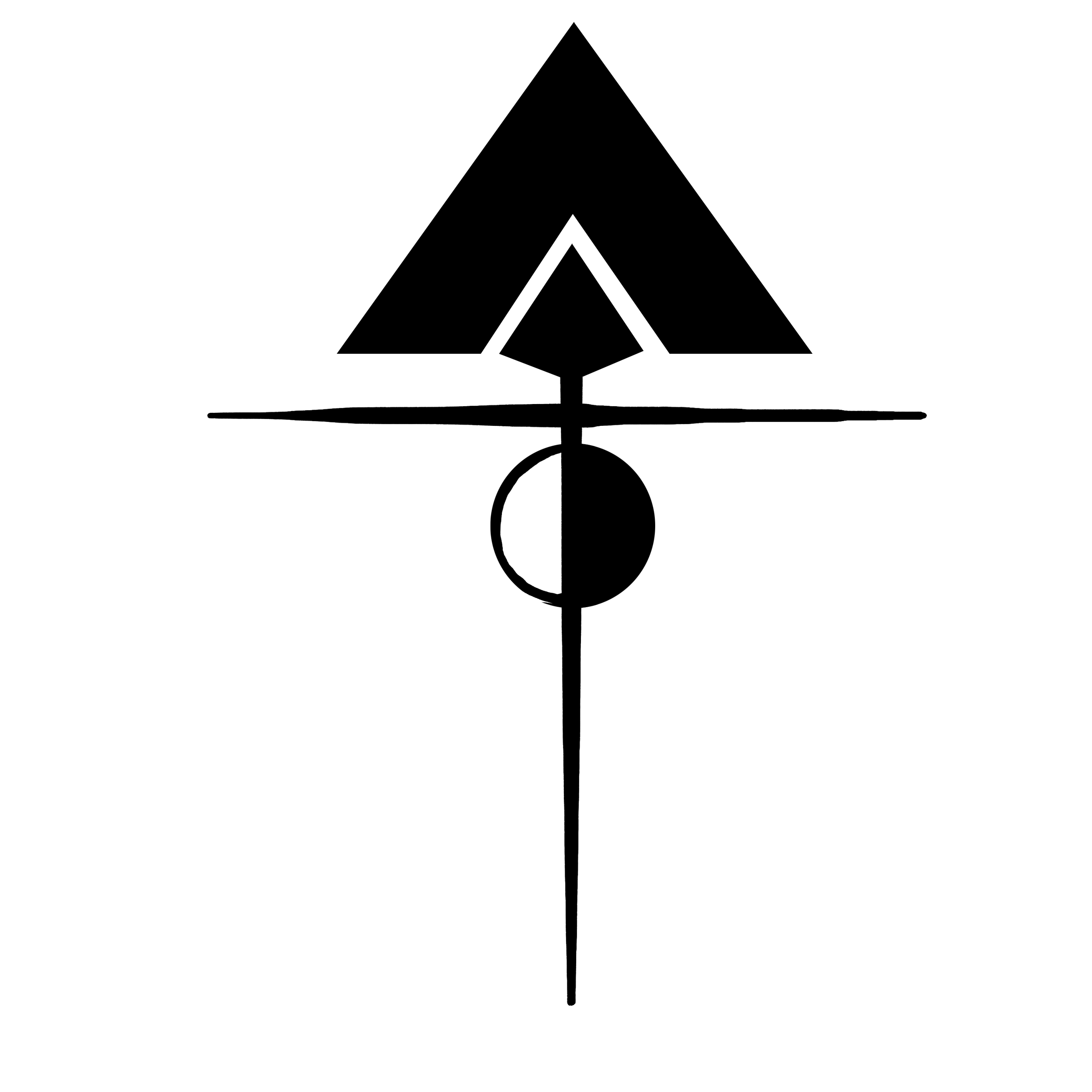

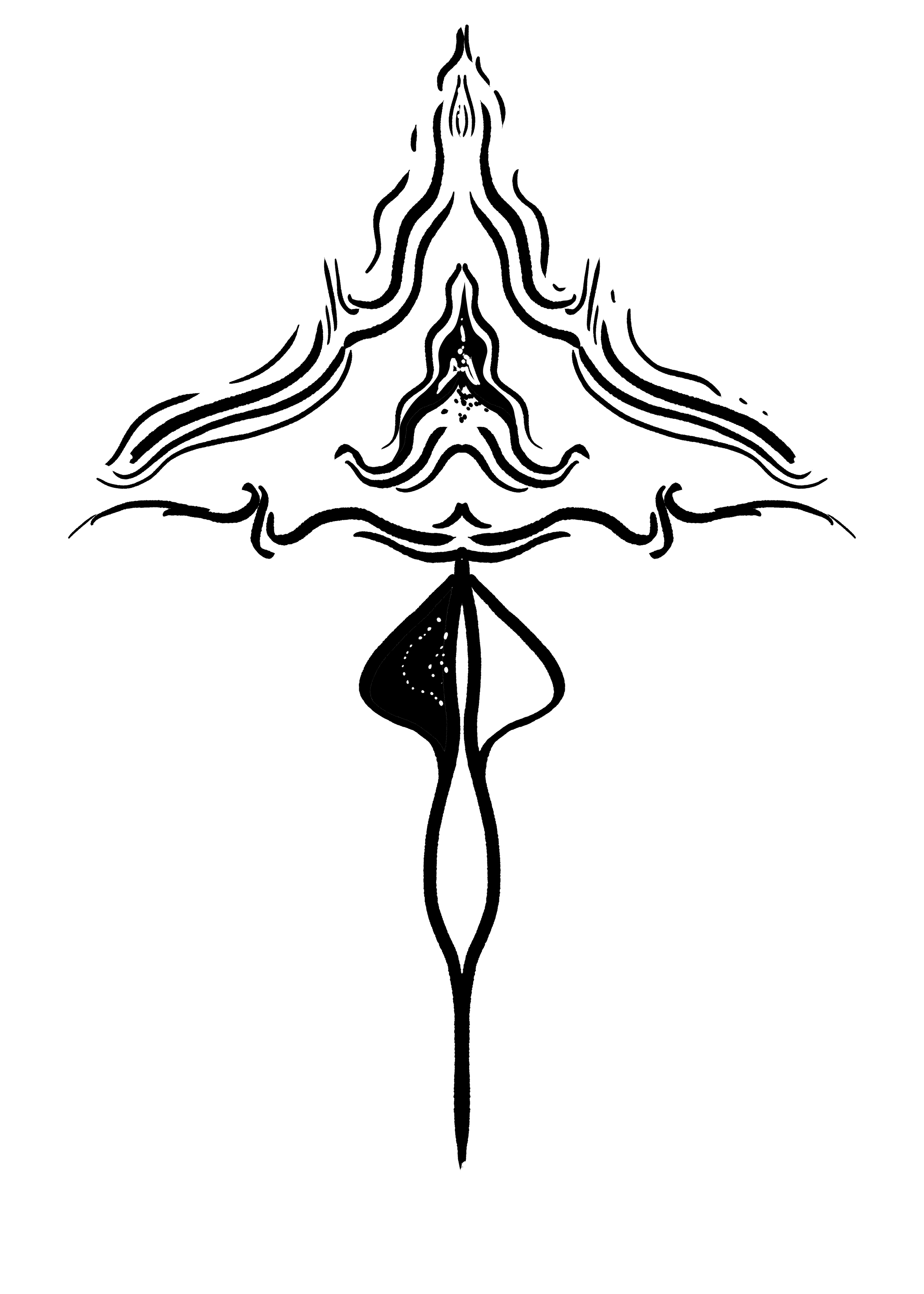
As years went on, the symbol morphed and expanded to fill whatever niche it needed—chapter illustrations, gifts for fans, bumper stickers and book spines. So far ten fans have reached out with pictures of their symbol tattoos—a surreal level of success.
merchandise
Shirts


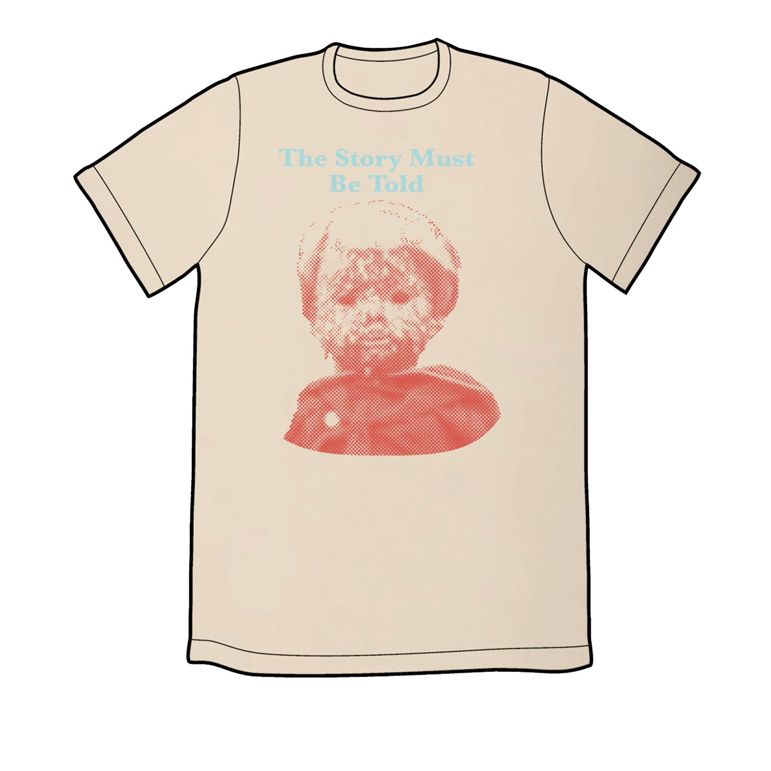
The t-shirts were meant to capture the lore of the podcast. Popular themes and characters are represented—the Boy, Chalms, the cult’s soda of choice. For the top patreon tier, the design is based on a fan favorite episode, “The Mathematics of Grocery Stores.”
Stickers

The four stickers
For the stickers, the goal was to capture the podcast’s branding—merch that could act as marketing and listener outreach. The stickers featured the cryptic symbol, the podcast logo, the podcast title, and one of the more prominent catch phrases, “The Story’s gonna get me!”
Enamel Pin

The enamel pin design file

The physical pin
I was grateful to have designed a number of enamel pins when it came time for a pin design. Enamel pins are tricky—each color must be perfectly banded by metal, and too complicated a design in terms of colors or shape can increase price. Enfolding the design in a circle and limiting the colors helped make this an affordable piece of merch for the fans.
Coffee Mug

The mug front

The mug back
The mug design references a recurring joke on the podcast, that the cult-endorsed soda brand is best consumed boiling hot. It is meant to blend in with the typical mugs you’d find in an office kitchen.
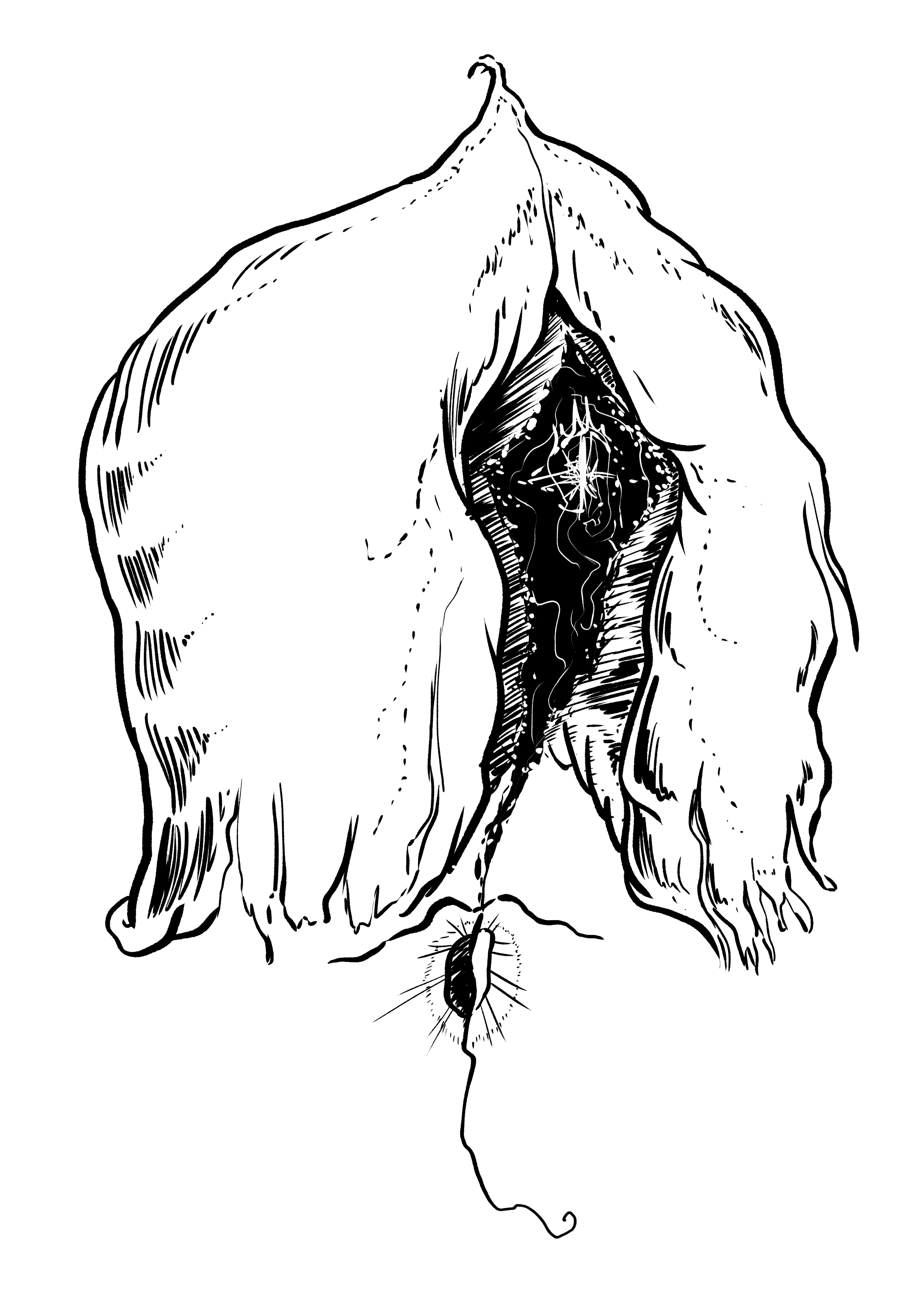
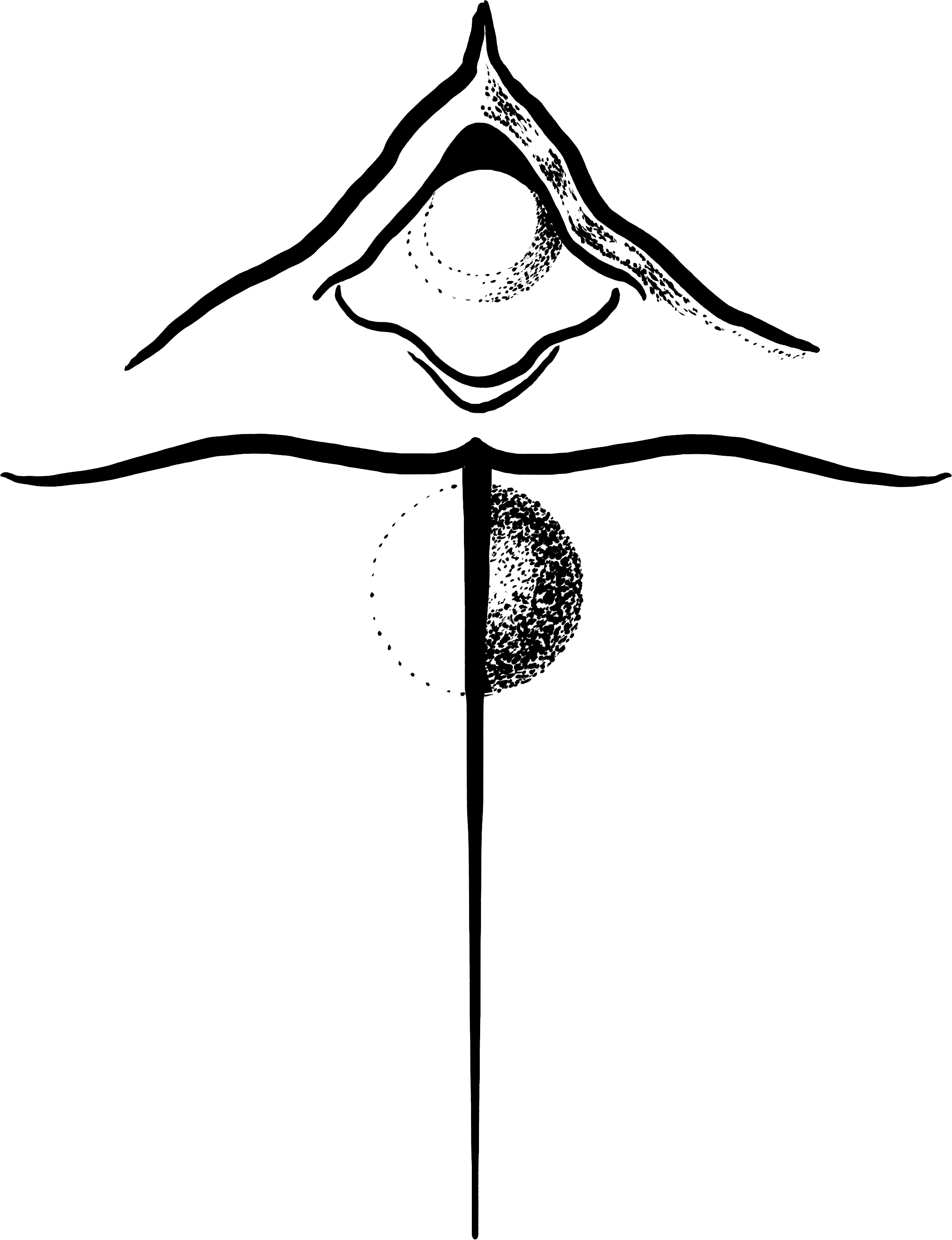
Books
For the first two books released by the podcast, the creators wanted a design that again mimicked cult literature. The designs are simple, with the trademark primary color scheme, utilizing photos converted to halftones in Photoshop.

Book cover for the poetry collection

Book cover for the short story anthology
I took the Seasons of the Story photo myself, dipping my wife’s hands in pancake batter mixed with broken Cheerios to make it look lumpy and drippy. The Psalms 1 photo reference was of the physical Chalms doll created by the director of the show as a film prop.

Seasons of the Story original photo reference

Psalms 1 original photo reference provided by Adam Wirtz
promotional materials
Pitch Deck
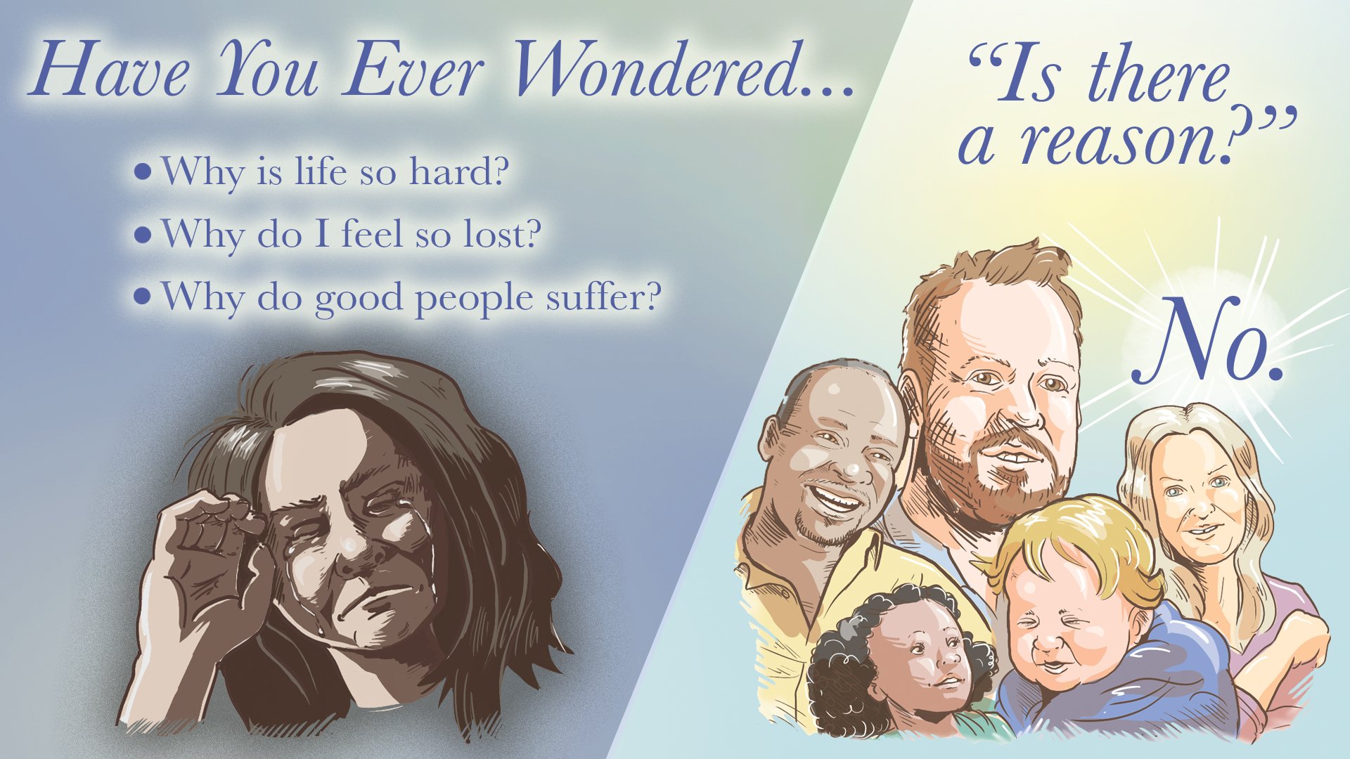
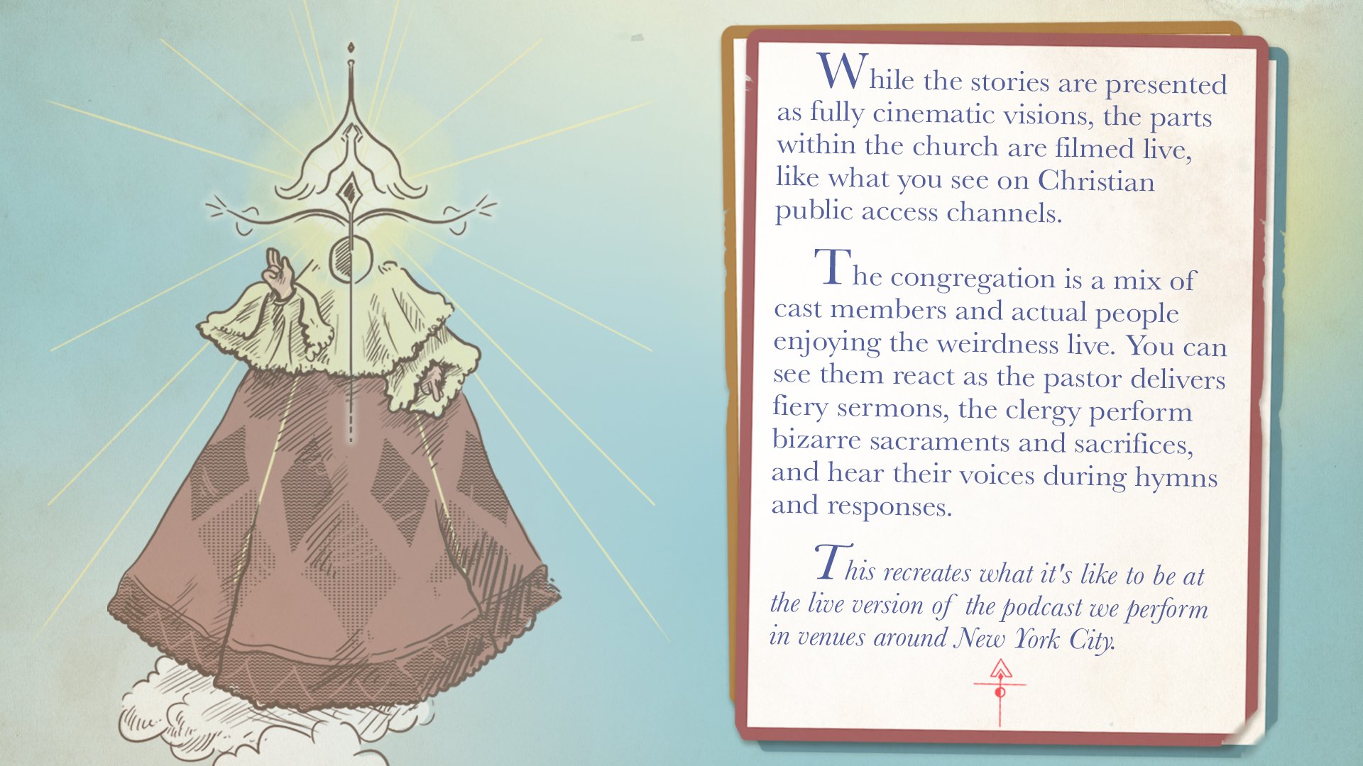
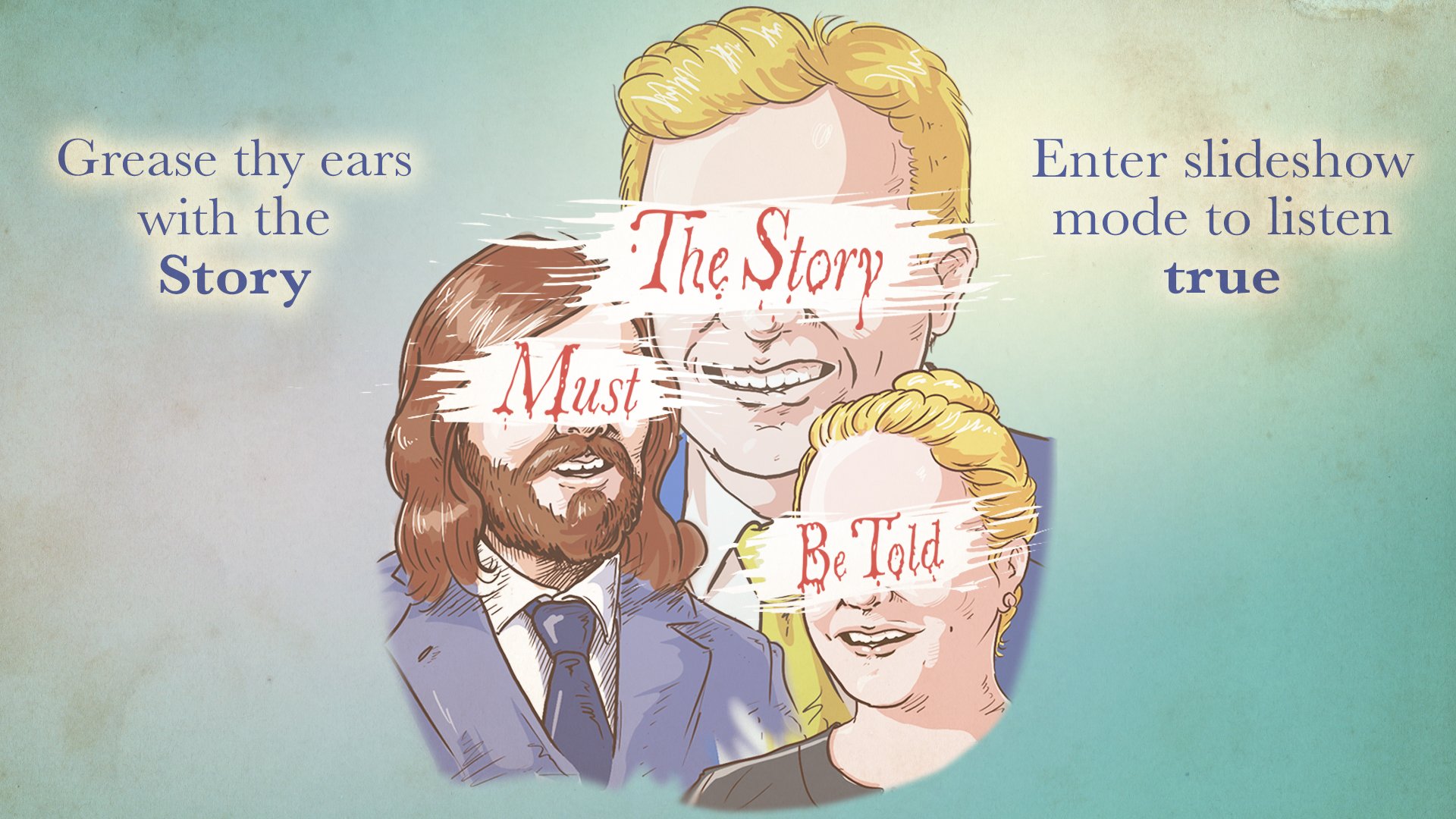
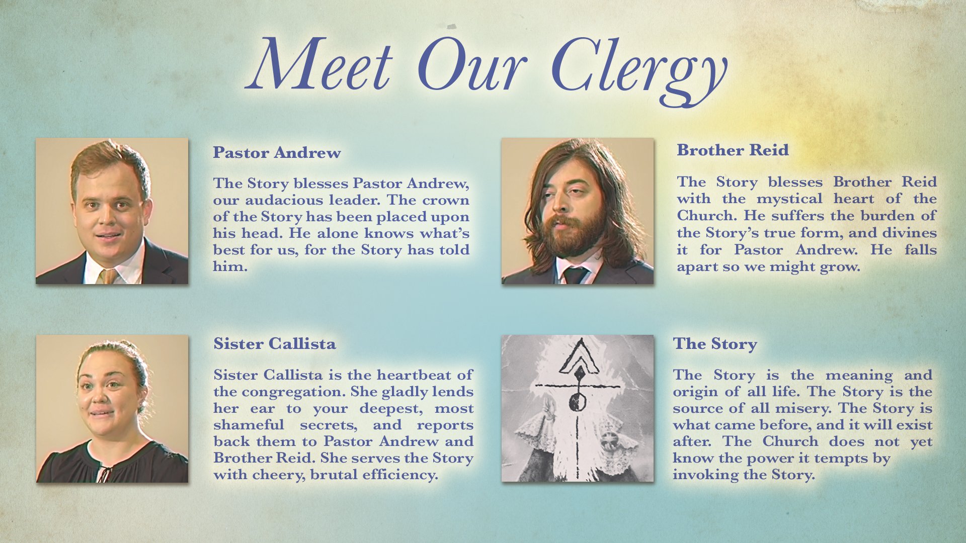
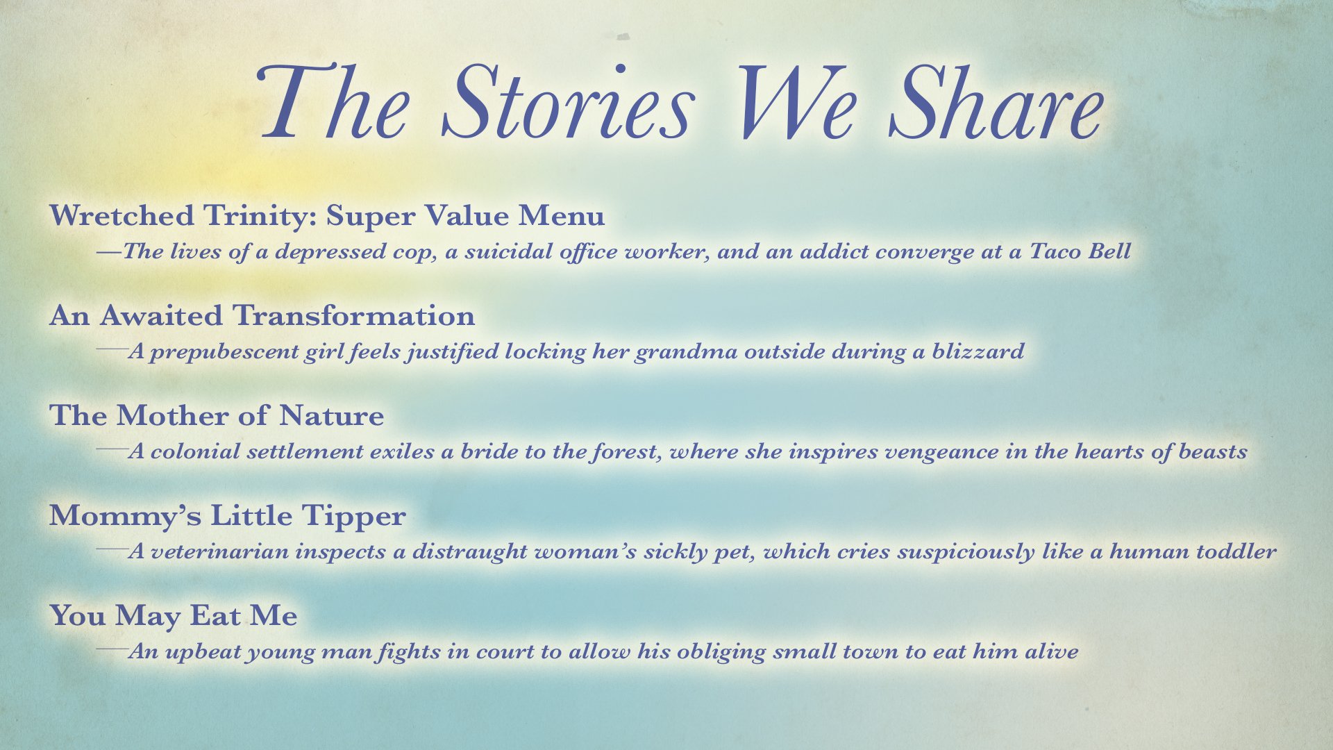
The podcast was selected by a former producer of Portlandia to shop it around as a potential television show. Below is the pitch deck the creators made to supplement the pitch materials.
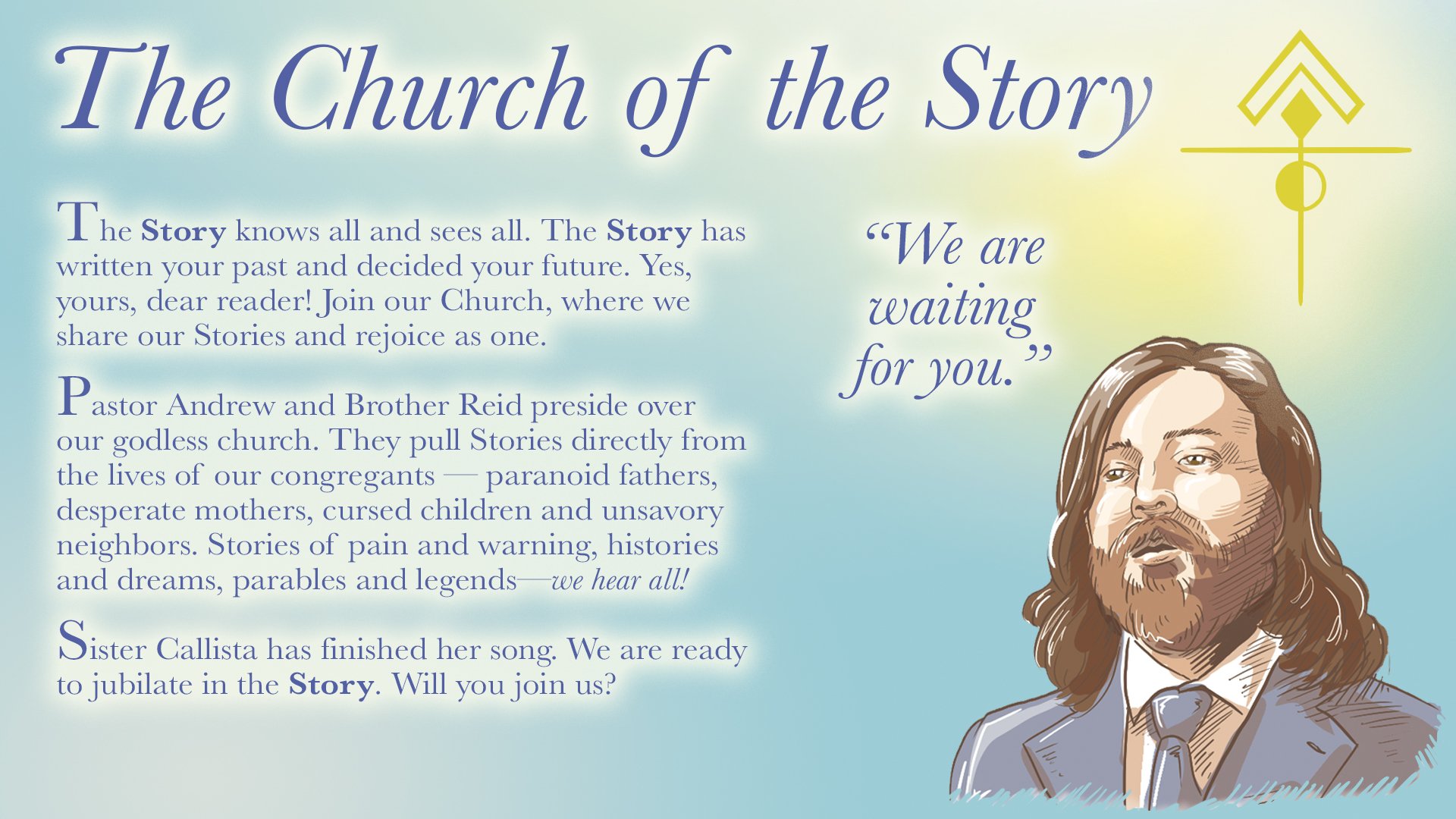
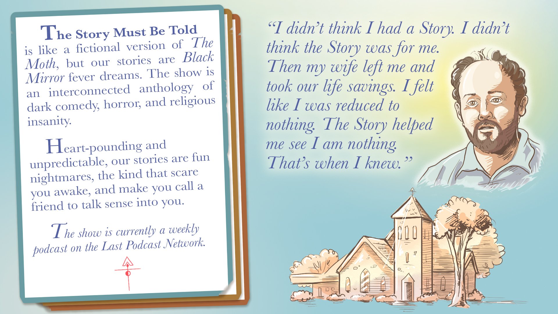
Pamphlet

Pamphlet outside

Pamphlet inside

A wild pamphlet
The pamphlet was an essential part of marketing—the perfect encapsulation of the uncanny cult aspect. It was based directly on cult literature gathered in a subway station, mimicking the art style but applying a more obvious unsettling twist. It was part of the membership packet for select patreon tiers. The images of the cast would be repurposed for social media profile pictures.
Fans really came to love the pamphlet, even printing their own and placing them in real locations. I hope to find one in the wild someday.
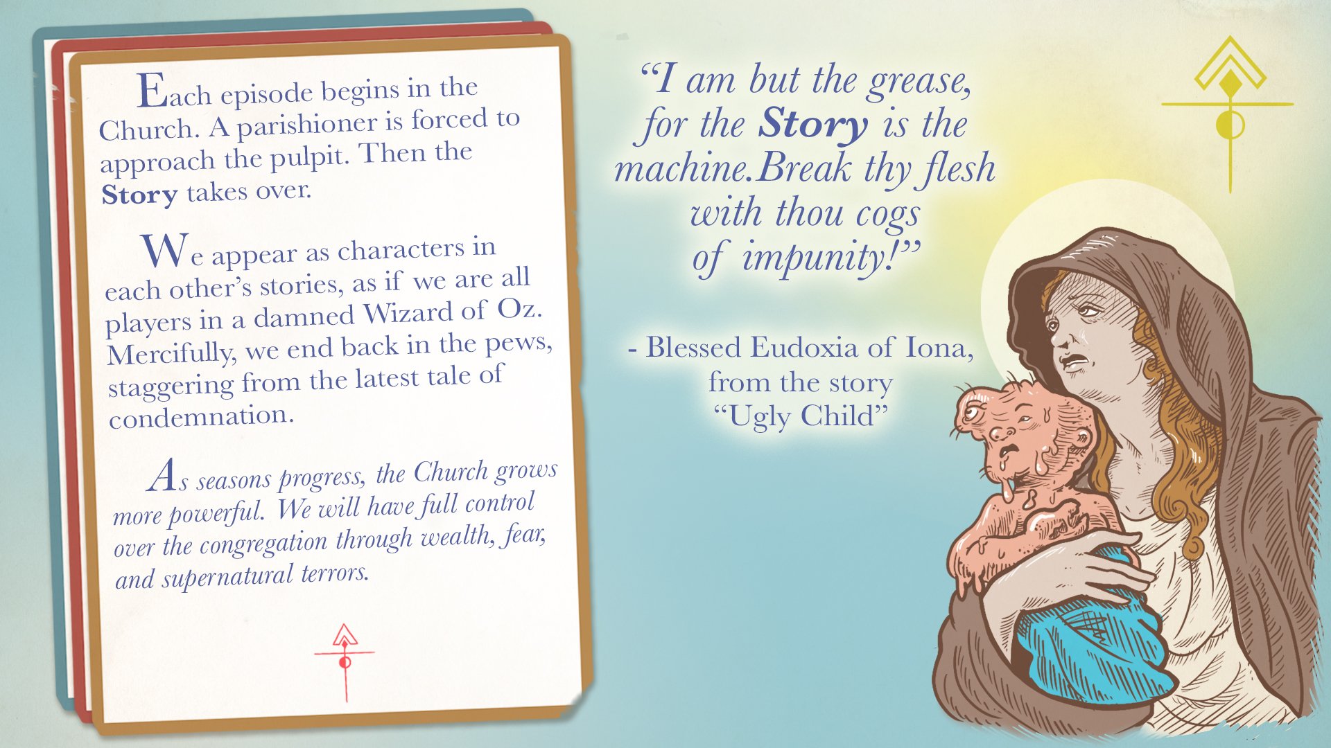
Membership pin and card

Button design
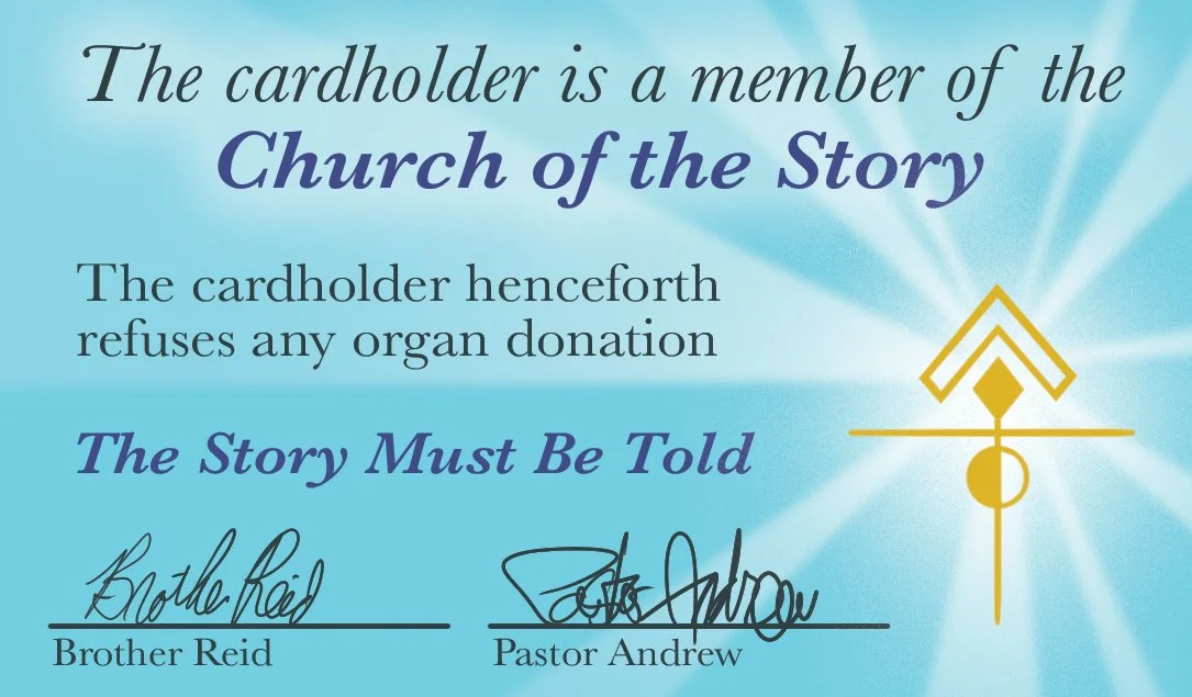
Membership card design
A button and membership card completed the membership packet. Later, the creators decided to manually cross out “refuses any organ donation” on every card. Sometimes, the cult aspect got a little too uncanny even for them.

The full membership package